QC Reports
Overview
The auto_process run_qc command outputs an HTML report for the QC for each of the projects in the analysis directory, which enables an assessment of the quality of the Fastq files for each sample in the project and tries to highlight aspects which might pose problems with the data in subsequent analyses.
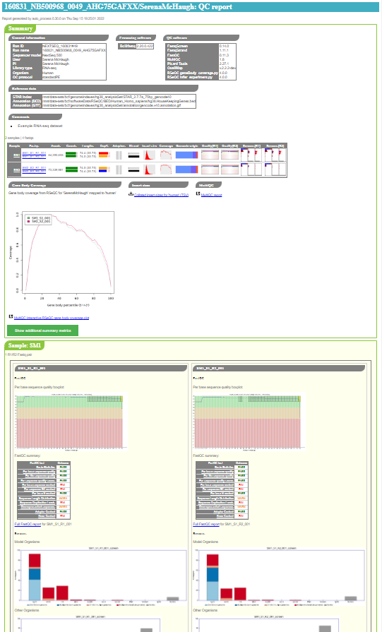
An example of the top of a QC report index page is shown below:
Report structure
Each report consists of a number of different elements which are shown schematically below:
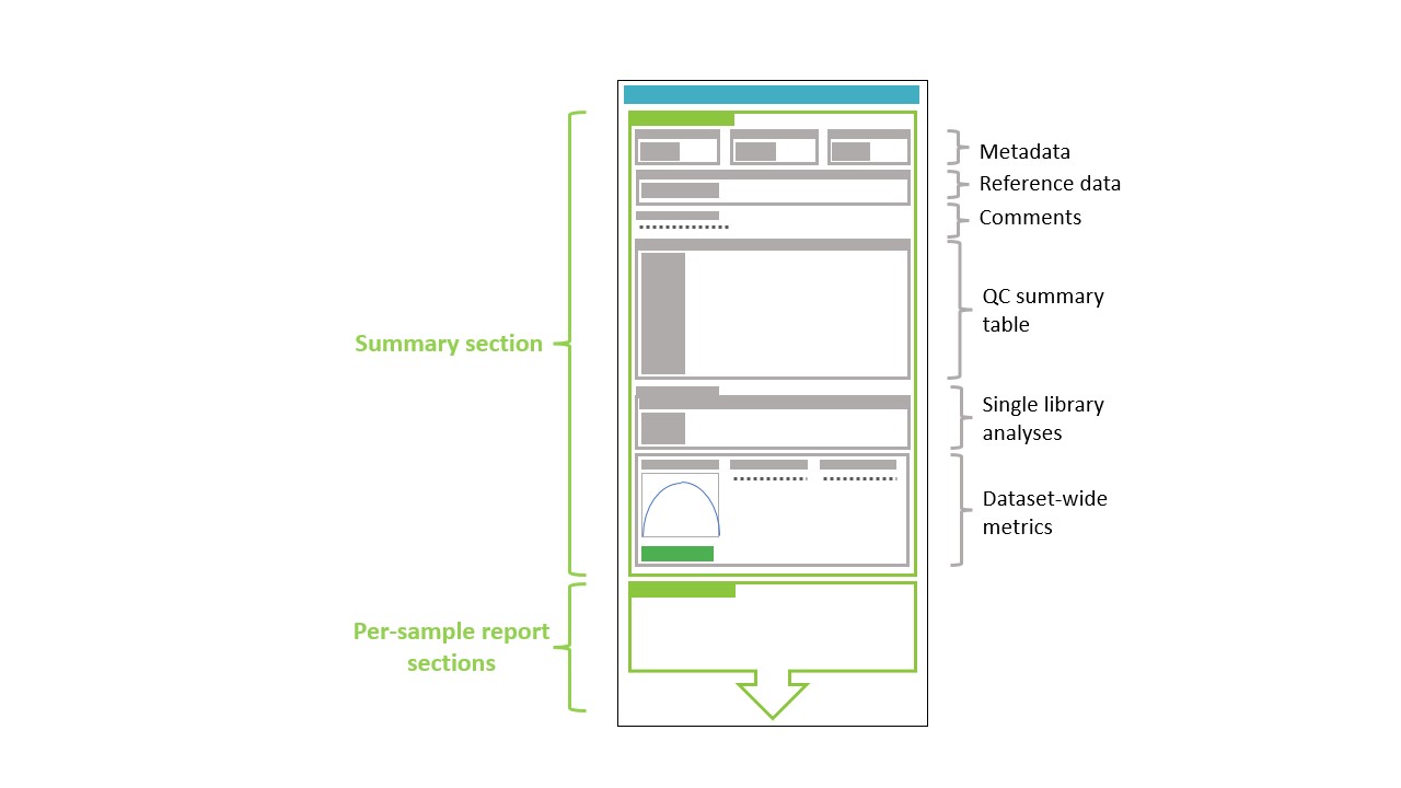
The key element is the top-level summary section which itself consists of a number of subsections:
Below this top-level summary there are more detailed per-sample and per-Fastq reports (see Full QC outputs per Fastq).
Metadata, reference data and comments
This section contains a number of tables and subsections which summarise information associated with the project and QC:
General information including the user, PI, library type, organism(s) and QC protocol
Processing software and versions (if available)
QC software and versions (if available)
Reference data such as Cellranger and STAR indexes
Comments associated with the project
QC summary table
The QC summary table summarises the key QC results for each sample and Fastq or Fastq pair (for paired end data).
For example:
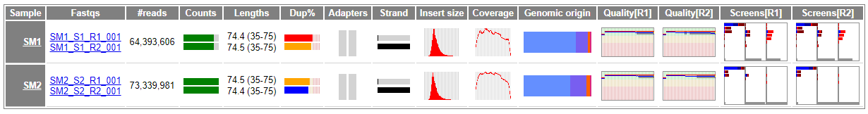
The summary includes the following basic information for each sample and Fastq:
Sample name
Fastq names associated with each sample
Number of reads or read pairs for each Fastq
Mean and range of sequence lengths for each Fastq
Additionally the following metrics are reported (typically in the form of small summary plots, which are described in the appropriate sections below):
One purpose of this table is to help pick up on trends and identify any outliers within the dataset as a whole; hence the main function of these plots are to convey a general sense of the data.
Note that not all outputs might appear, depending on the QC protocol that was used.
The sample and Fastq names in the table link through to the full QC outputs for the sample or Fastqs in question; other items (e.g. the quality boxplots) link to the relevant parts of the full QC outputs section (see Full QC outputs per Fastq).
Quality boxplots
The summary table includes a small version of the sequence quality
boxplot from fastqc, for example:

A larger version of the plot is presented in the Full QC outputs per Fastq section.
Fastqc summary plots
The output from fastqc includes a summary table with a set of
metrics and an indication of whether the Fastq has passed, failed
or triggered a warning for each.
The summary table includes a small plot which gives an impression of the overall state of the metrics for each Fastq file, for example:

Each bar in the plot represents one of the fastqc metrics,
(for example “Basic statistics”, “Per base sequence quality”, and
so on); the colour (red, amber, green) and position (left, centre,
right) indicate the status of the metric as determined by
fastqc.
The data are presented in more detail in a table in the Full QC outputs per Fastq section.
Fastq_screen summary plots
The summary table includes a small plot which represents the
outputs from fastq_screen, for example:
The three boxes represent (from left to right) the model organisms,
other organisms and rRNA plots produced by fastq_screen. The
full plots and links to the raw data for each screen can be found
in the Full QC outputs per Fastq section.
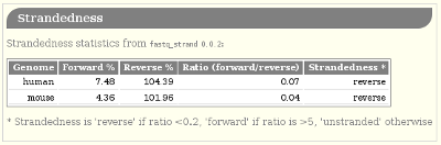
Strandedness
fastq_strand.py runs STAR to get the number of reads which
map to the forward and reverse strands; it then calculates a
pseudo-percentage (“pseudo” because it can exceed 100%) for foward
and reverse.
The summary table reports the pseudo-percentages as a barplot with a pair of barplots, where the top bar represents the forward pseudo-percentage and the bottom bar the reverse value.
Some examples:
Example |
Interpretation |
|---|---|
|
Likely forward stranded |
|
Likely reverse stranded |
|
Likely unstranded |


More detailed information about the strandedness statistics is given in the Full QC outputs per Fastq section.
Read count plots
The read count plots indicate the relative number of reads for each Fastq, and the proportion of those reads which are masked and/or padded.
The solid portion of the bar represents the number of reads in the Fastq file, scaled to the highest number of reads present across all Fastqs in the project (so the largest Fastqs will have a bar consisting entirely of solid colours).
Within the solid portion of each bar, different colours represent the proportion of reads which are either masked (red), padded (orange), or neither masked or padded (green).
Note
“Masked” reads have sequences which consist entirely of N’s (e.g.
NNNNNNNNNNNNN), whilst “padded” reads have sequences which have
one or more trailing N’s (e.g. ATTAGGGCCNNNN).
Examples:
Example |
Interpretation |
|---|---|
|
Good data: no masked or padded reads present in Fastq (bar is green) & high number of reads compared to largest Fastq in report (solid portion occupies most of plot) |
|
Good data: no masked or padded reads but small number of reads compared to largest Fastq in report (solid portion occupies small part of plot) |
|
Reasonable data: only small proportions of masked (red portion of bar) and padded reads (orange portion of bar) & highest number of reads across all Fastqs in report (plot is entirely solid colour) |
|
Poor data: high proportions of masked (red portion of bar) and padded reads (orange portion of bar) |


Sequence length distribution plots
The sequence length distribution plots are histograms showing the
relative number of reads with different sequence lengths. The data
is analogous to that shown in the
Sequence Length Distribution
module of fastqc.
Typically for trimmed data the plots will look like e.g.:

An example with a range of sequence lengths from an adapter-trimmed miRNA-seq dataset which shows peaks for shorter sequence lengths followed by a long tail:

For untrimmed data or other datasets where all sequences are the same length, plots will look like e.g.

Sequence duplication summary plots
The sequence duplication summary plots indicate the level of
sequence duplication in the data, according to the
Sequence Duplication Levels
module of fastqc.
The duplication level is the percentage of reads that are would be removed when reads with duplicated sequences (i.e. sequences that appear in multiple reads) are counted as a single read. It is an indication of the number of reads with distinct sequences within the data (as lower duplication indicates fewer distinct sequences).
(See the Biostars thread
Revisiting the FastQC read duplication report for more explanation of the deduplication in fastqc.)
In the plots the solid portion of the bar represents the fraction of reads removed by deduplication, and the colour of the bar indicates which category the data fall into depending on the level of reads remaining:
Red indicates less than 20% reads remain after deduplication (i.e. more than 80% reads were duplicates)
Orange indicates 20-30% of reads remain (i.e. between 70-80% reads were duplicates)
Blue indicates more than 30% of reads remain (i.e. less than 70% reads were duplicates)
Note
The thresholds used in this plot differs from those used by
fastqc.
The background of the plot also uses lighter versions of these colours to indicate the thresholds.
For example:
Example |
Interpretation |
|---|---|
|
Fail: more than 80% of reads are duplicated |
|
Warn: between than 70-80% of reads are duplicated |
|
Pass: less than 70% of reads are duplicated |
|
Plot background with no data (to show thresholds for pass, warn and fail) |


Adapter content summary plots
The adapter content summary plots condense the data from the
Adapter Sequences
module of fastqc into a single metric, to indicate the proportion
of adapter sequences in a Fastq file.
A single adapter fraction is obtained for each adapter class
detected by fastqc by calculating the fraction of plot area
which lies under the curves for each adapter in the “Adapter Content”
plots. This is then represented as a bar where the coloured portion
corresponds to the fraction for each adapter.
Note
The colours of the bar match the colours used by fastqc for
different adapter classes.
For example:
Example |
Interpretation |
|---|---|
|
No adapter content detected (bar is grey) |
|
Small amount of adapter content detected (bar is partially solid, with green colour indicating presence of Nextera Transposase sequences) |
|
Significant adapter content detected (more than 50% of the bar is solid, with red colour indicating presence of Illumina Universal Adapter sequences) |


Insert size distribution plots
These plots are small versions of the insert size distribution
histograms output by Picard’s CollectInsertSizeMetrics utility.
For example:

The insert size metrics are also collated across all samples into a single TSV file (see Collated insert sizes).
Qualimap coverage plots
Plot summarising the mean coverage profile of all transcripts with non-zero coverage as produced by Qualimap’s RNA-seq analysis; essentially these are the data from the coverage_profile_along_genes_(total).txt output file.
For example:

Qualimap origin of genomic reads plots
Bar chart summarising the genomic origin of reads data from Qualimap’s RNA-seq analysis; specifically this indicates the fraction of the read alignments which fall into exonic, intronic and intergenic regions.
For example:

Single library analyses
For 10x Genomics datasets single library analyses may also have
been performed for each sample using the count command of the
appropriate 10xGenomics pipeline (e.g. cellranger for scRNA-seq
data, cellranger-atac for scATAC-seq data etc).
In these cases an additional summary table will appear in the report
with appropriate metrics for each sample along with links to the HTML
reports from the count command. For example, for an scRNA-seq
dataset:
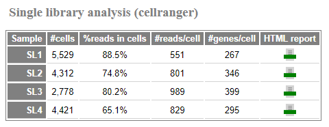
The reported metrics will depend on the pipeline and type of data.
Details of the contents of the linked web_summary.html report can
be found in the appropriate documentation for the 10xGenomics pipeline:
cellranger: https://support.10xgenomics.com/single-cell-gene-expression/software/pipelines/latest/output/summary
cellranger-atac: https://support.10xgenomics.com/single-cell-atac/software/pipelines/latest/output/summary
cellranger-arc: https://support.10xgenomics.com/single-cell-multiome-atac-gex/software/pipelines/latest/output/summary
Note
The full set of outputs can be found under the cellranger_count
subdirectory of the project directory, when single library
analysis has been performed.
Note
For single cell multiome datasets there may also be a summary table for CellRanger ARC’s single library analyses; similarly for CellPlex datasets a summary table for the multiplexing analysis may be present (in both cases depending on the contents of the QC directory).
Dataset-wide metrics and reports
This section contains any dataset-wide metrics and additional reports, including:
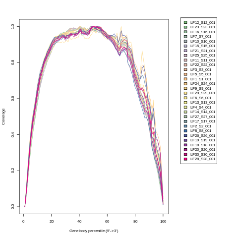
RSeQC gene body coverage plot
This is the gene body coverage plot generated by RSeQC’s
genebody_coverage.py utility, as a PNG.
For example:
Collated insert sizes
This is a TSV (tab-delimited values) file which contains the
following data for each aligned Fastq, from the output of Picard’s
CollectInsertSizeMetrics command:
BAM file name
Mean insert size
Standard deviation
Median insert size
Median absolute deviation
MultiQC report
The HTML report generated by MultiQC when run on the QC directory.
Full QC outputs per Fastq
After the summary table, the full QC outputs for each Fastq or Fastq pair are grouped by sample, for example:
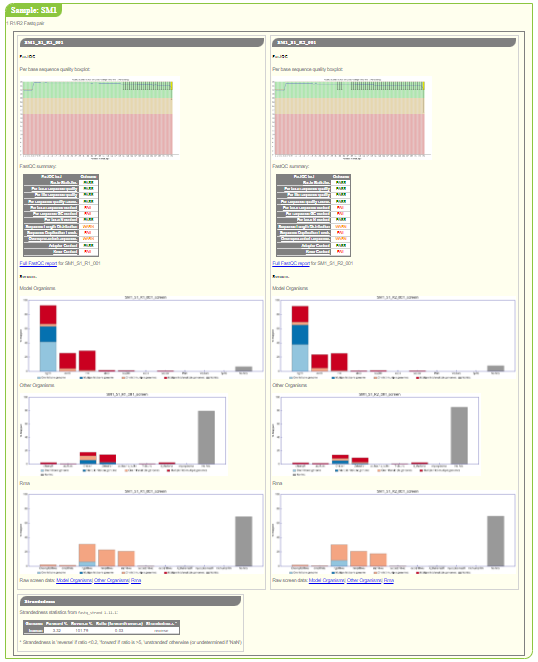
For each Fastq the subsections consist of:
fastqcoutputs including the sequence quality boxplot and a table of the quality metrics with links to the full report: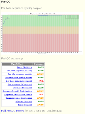
fastq_screenoutputs for each screen, for example: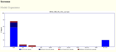
fastq_stranddata: